A logo only a Yahoo could love…
There’s a reason why I had to reprint of Marrisa Mayer’s “tumblr” – it was simply unreadable in it’s original form. Why?
Let me just give you a little bit of background here for a second…
As chronicled in the book “I'm Feeling Lucky: The Confessions of Google Employee Number 59” by Douglas Edwards, Miss Mayer changed the font on the site’s results page to Verdana because a “report” and “statistics” told her it was the “right” thing to do without looking to see how it would render in all browsers. Now, taking a look at her “tumblr” page she’s using the dreaded white text on a black background – despite countless research that explains why this is a horrible thing to do for your readers. As any design teacher will tell you, it only looks “cool” superficially – use it when you really don’t want your visitors to read your text. You would think that a woman who is obsessed with “data” and “research” into what’s more “readable” would know better.
This gets me to the type of leader I have the least respect for; the bosses, managers, supervisors, and executives who hire experts then won’t trust the people they hire. After you hire a graphic designer to do design work why wouldn’t you not trust their experience and education when creating a design? Or do you just like to have people surrounding you who are “only the best” and you still have to do everything yourself – which implies everyone else is incompetent and you know enough about everything to get all the work done.
Do I have enough time and space to vent about that?
My thoughts about the logo itself: Despite all my criticism above I have to admit that this logo does its job. I dislike it when a company will totally undo its logo just because. You only totally revise it when you need to distract from your potential clients from your prior mistakes or blunders.
When Pepsi redid their logo from the Red White And Blue “Ying/Yang” symbol to something that looks like a pictogram of a fat kid with his belly sticking out of his shirt – it was a total fail. What were they trying to hide, what were they trying to distract customers from? Pepsi should have made a much more subtle change to their logo or just leave it alone since they were a successful company… it was an unnecessary change.
Yahoo!’s logo change isn’t that radical. It’s subtle while being cleaner and fresher than the original. It’s not so much as a departure than it is a refresher – much the same way grocery stores rearrange the isles to keep you wandering around looking for what’s on your list in the hopes you’ll stumble upon something new.
It’s not bad, but it’s not great, either. It’s like going from “vanilla” to “French Vanilla!”
Geeking Out on the Logo
So, tonight we unveiled the new Yahoo logo, concluding our 30 days of change.
We hadn’t updated our logo in 18 years. Our brand, as represented by the logo, has been valued at as much as ~$10 billion dollars. So, while it was time for a change, it’s not something we could do lightly.
On a personal level, I love brands, logos, color, design, and, most of all, Adobe Illustrator. I think it’s one of the most incredible software packages ever made. I’m not a pro, but I know enough to be dangerous :)
So, one weekend this summer, I rolled up my sleeves and dove into the trenches with our logo design team: Bob Stohrer, Marc DeBartolomeis, Russ Khaydarov, and our intern Max Ma. We spent the majority of Saturday and Sunday designing the logo from start to finish, and we had a ton of fun weighing every minute detail.
We knew we wanted a logo that reflected Yahoo - whimsical, yet sophisticated. Modern and fresh, with a nod to our history. Having a human touch, personal. Proud.
Other elements fell quickly into place:
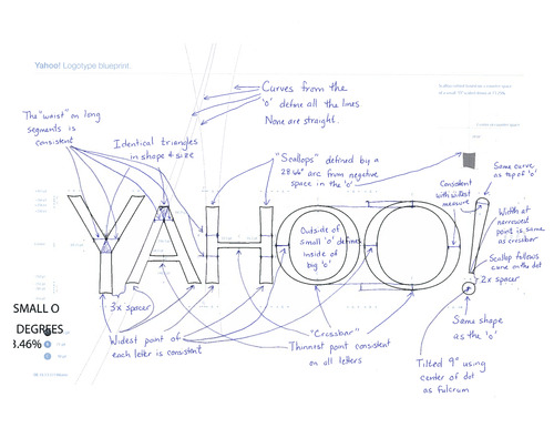
- We didn’t want to have any straight lines in the logo. Straight lines don’t exist in the human form and are extremely rare in nature, so the human touch in the logo is that all the lines and forms all have at least a slight curve.
- We preferred letters that had thicker and thinner strokes - conveying the subjective and editorial nature of some of what we do.
- Serifs were a big part of our old logo. It felt wrong to give them up altogether so we went for a sans serif font with “scallops” on the ends of the letters.
- Our existing logo felt like the iconic Yahoo yodel. We wanted to preserve that and do something playful with the OO’s.
- We wanted there to be a mathematical consistency to the logo, really pulling it together into one coherent mark.
- We toyed with lowercase and sentence case letters. But, in the end, we felt the logo was most readable when it was all uppercase, especially on small screens.
And, we were off. Here is the blueprint of what we did, calling out some of what was cool/mathematical:

Our last move was to tilt the exclamation point by 9 degrees, just to add a bit of whimsy.
Prior to the weekend, we had also polled our employees on the changes they wanted to see. Interestingly, 87% of our employees wanted some type of change in the logo (either iterative or radical). In terms of specific attributes, our employees had wanted:
- sans serif
- variable size letters
- a variable baseline
- a tilted exclamation point
- and the majority of their favorite logos were uppercase.
While we hadn’t set out to explicitly fill each request, we met a lot of what the people who know us best felt suited us best.
Color and texture were pretty easy. Our purple is Pantone Violet C - a pantone that needs no number and no introduction ;). For the texture, we came up with the nice idea of creating a chiseled triangular depth to the logo - this causes the letter Y to appear in the shading at the ends of each of the letters.

Over the subsequent weeks, we’ve worked on various applications and treatments of the logo (the favicon, app launchers, sub-brand lockups). It’s held up well. And, while moving forward we’re likely to make small iterative changes along the way rather than dramatic ones, we’re really happy with where we ended up. We hope you are too!
Here’s a fun video (created by our amazing intern Max) that animates the design notes:
No comments:
Post a Comment